Making DNA Look Simple
by
 Biologists, especially people doing genetics, often want to show a diagram of a gene they’re studying, separated into its various parts (e.g. exons and introns) and displayed in a clear, intelligible way. Perhaps even more importantly, they want to include this picture in a publication, which means that it shouldn’t get blurry when it’s printed or magnified on a screen. I recently made a simple web app that helps biologists make these pictures, which I call the Exon-Intron Graphic Maker.
In this blog post, I’ll first give some basic background on the ins and outs of genes. Then, I’ll explain the features of the tool. Why make something by hand when you can use a program to make it more accurately, more quickly, more consistently, and with less effort? I ask myself this very question daily, and so far it’s driven me to write software to automate those repetitive tasks that, quite frankly, a computer should just be doing instead of me.
First, some background. The most important concept in the field of molecular biology is known as the “central dogma”. The central dogma basically says that in a cell, DNA is used make RNA, and RNA is used to make protein. Proteins are the physical chunks of molecules that enable the cell to do many of the things that a cell does: move around, ingest things, secrete things, stuff like that. While the central dogma is a simplified view of molecular biology, it seems to be mostly right.
So let’s talk about the first two pieces, the DNA and the RNA. DNA and RNA consist of repeated molecules chained together. The molecules that make up DNA and RNA are called “nucleotides” (also known as “bases”), and there are 4 different kinds: adeninine (A), cytosine (C), guanine (G), and thymine (T) in DNA or uracil (U) in RNA. When you identify the order of these nucleotides in a specific piece of DNA/RNA (e.g. ATTTTCGATCGCTTTAGC) you’re said to have “sequenced” the DNA/RNA.
What surprised many biologists when they began sequencing DNA/RNA was that though there was a ton of DNA (billions of nucleotides in humans, a hundred million in the microscopic worm C. elegans), only a small fraction of it was found as RNA. If I remember right, the statistic is something like ~1% of DNA actually transcribes into RNA in humans.
One last definition: a portion of DNA that will eventually be converted via RNA into a single protein is called a “gene”. So within a given gene, biologists found that some parts get cut out of the associated RNA before it can be translated into protein. These parts of a gene are called “introns”, while the parts that stick around in the RNA molecule are called “exons”.
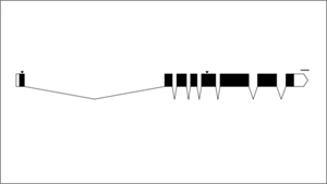
Phew, background done, now to the meat of it all. Often when a biologist publishes a paper on a gene they’ve been studying, they’ll show the exon/intron map of the gene in a simple schematic like so:

In this graphic, the exons are indicated as black rectangles. Filled rectangles indicate RNA that is translated into protein, while unfilled rectangles indicate RNA that is not translated into protein, though also not cut out like introns are. These untranslated parts are known as “untranslated regions” or “UTRs”. The introns are indicated as bridging gaps. This representation of an intron is appropriate because the RNA effectively gets “stitched” together in this way, with introns getting cut out. In the example above, the gene has 8 exons and 7 introns. These diagrams are also supposed to be to scale, so that the lengths of the rectangles and gaps correspond proportionately to the lengths of the exons and introns that underly them. The little downward arrows above the exons point to specific bases (e.g. ones that have been mutated). The upward-facing horizontal brackets below the introns indicate regions of interest (e.g. parts of the gene that have been deleted).
I was talking to some labmates about these graphics, particularly wondering how they generate them for their papers. As it turned out, both of my friends drew them by hand on a computer, counting out the number of nucleotides in each exon and each intron and drawing boxes and lines of roughly the same proportions. This seemed tedious and error-prone, so I asked them if they knew of any programs that could make these graphics for them. They knew of none, and I mentioned that it would be trivial for a programmer to make one. They thought it would be really useful if someone made such a program, but of course they themselves didn’t know how to program. So I added it to my mental list of nifty tools for scientists that I might one day make.
Waking up one Saturday morning, I sat in front of my computer with nothing particularly interesting to do. For reasons still unbeknownst to me, 7 hours later, I snapped out of a reverie to discover that I had written such a program (the example above was rendered with it). So here it is:
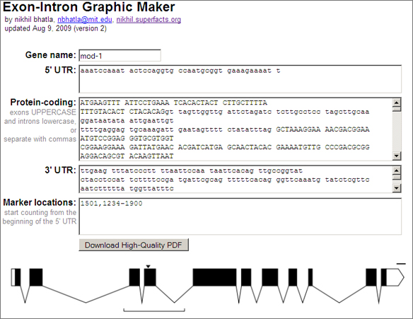
Exon-Intron Graphic Maker
Perhaps the most important feature of this webapp is that it produces a vectorized, high-quality PDF of the inputted gene model. When submitting a paper to a journal for publication, the journal requires high dpi, publication-quality graphics (simple bitmaps just don’t print well). With a PDF containing vector graphics the biologist can scale the gene model to whatever size and resolution they wish, annotate it with other information (e.g. scale, gene name, mutation names), and submit it to the journal, all without any loss of visual quality.
Anyhow, that’s it. Useless to most, but hopefully it will save a small number of people a few buckets of hours. I know at the very least that I’ll use it (assuming, of course, that I get to the point in my project that I actually have a gene I want to talk about :)).
Enjoy.
My name is Nikhil Bhatla, and I’m a 3rd year graduate student at MIT in the Brain and Cognitive Sciences program. I study the neurobiology of C. elegans in the Horvitz lab, and was driven to grad school by an interest to understand mechanisms that might underly consciousness. I’m currently trying to train the diminutive worm in a classical conditioning task that correlates with conscious awareness in humans (so far with no luck). I keep my own blog and you can email me at nbhatla@mit.edu.


dayman
wrote on November 20, 2009 at 11:39 pm
wow. that is so much easier than drawing everything! thanks nikhil!
katie@benchfly.com
wrote on November 23, 2009 at 7:41 pm
Thanks for putting in the time to make this, will be a must use in the near future for me!
Kamal
wrote on April 10, 2012 at 3:22 am
It would be more useful if many genes of a family can be drawn together and if color can be given to exons..
nikhil
wrote on June 20, 2012 at 9:28 am
Hi Kamal,
If you download the PDF you can edit each exon’s color in a graphics program like Illustrator or Inkscape.
Also, I recently added the option to color in protein domains, so check that out.
I’m considering how to support alternative splicing and display of multiple genes all in the same diagram, so stay tuned.